According to the scientists, we are able to distinguish more than a million different colours.
However, this ability varies from person to person and we do not all perceive colours in the same way. So when it comes to printing your communication materials, it is essential that we agree on the perception of each shade, each colour.
For this reason, we suggest that you take a look at the so-called Pantone colours, which are an extremely useful reference system in this field. in this field.
Why is the Pantone colour system so useful?
Have you ever had a discussion with your colleagues where you couldn't agree on the colour of a wall, a piece of clothing or your company logo? Midnight blue, navy blue, indigo blue?
This is not surprising: not only do we not only do we all perceive colours in different ways - where some people can detect over 100 million hues, others can only see about 100 - but there are many factors that can affect our understanding of colour.
In printing, two factors in particular influence the interpretation of colours :
- the support The material: paper, cardboard, plexiglass or any other material does not reflect light in the same way and therefore influences our perception of colour.
- The environment The environment: obviously, lighting, weather conditions, natural light depending on the time of day, etc., also have an impact on our perception of colours. As well as associated colours because colours influence each other: you will not perceive a green colour in the same way if it is placed next to a blue or next to a yellow!
With all the possible interpretations, how can you be sure that the colour you see when printing your letterhead by us will be the one you had in mind when creating the design? Use Pantone colours!
Just like when you want to choose a new colour for your living room wall, you can, for all your printing work, you can consult a Pantone colour chart colour chart for all your printing needs, so you can choose exactly the colour you want for your graphic identity.

The Pantone colour code
Pantone is the name of a printing company where one of the employees once found an extremely effective way to speak the same language as his customers in terms of colours.
In 1963, the Pantone printing company created the Pantone Matching System (PMS), which quickly became the world reference for colour categorisation.
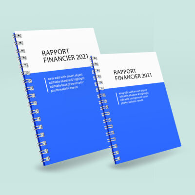
The Pantone Matching System is a colour referencing system that associates a specific code with the exact ink formula used for each colour. Thanks to this system, today when you order business cards with text to be printed in "Pantone 19-4052 Classic Blue", you tell us exactly what shade you want to see. We understand your requirements and you get exactly what you want. !
Initially, the Pantone colour code contained only ten or so shades. Nowadays, the Pantone Matching System - which is the Pantone reference for print, packaging, digital and screen printing - contains 9,758 colours.
The Pantone colour guides and colour charts have clearly become a staple in the colour world. They have been used and misused used and misused by artists, such asThey have often been used and misused by artists, such as photographer Angelica Haas, whose Humanae project shows models of various skin tones posing on backgrounds showing different shades of Pantone colours, accompanied by the exact Pantone colour reference.
For your work, you can consult these guides and Pantone colour charts and find the colour that best reflects your values and your business. Then, you can tell us your preferences and you will have two options:
- You want this exact Pantone colour. In this case, we will order the ink or inks in question specifically for your project from the Pantone company. You will get exactly the shade you want, but this choice has disadvantages in terms of lead times, costs and minimum print volumes.
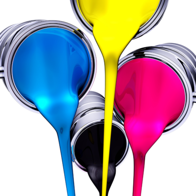
- You prefer to save money. We will help you to find an equivalent of the colours you have identified in the colour range for four-colour printing, the most widespread colour printing process. Indeed, the latest digital printing machines allow us to get very close to Pantone colours via the CMYK equivalence. In doing so, you will save the cost of the specific order for a final result extremely close to your initial project.

What are the uses for Pantone colours?
Why use Pantone colours rather than four-colour process printing (or CMYK for cyan, magenta, yellow and black)? Mainly because the range of possibilities is extremely wideThe main reason for this is that the range of possibilities is extremely wide, and you will find shades in the Pantone references that you cannot reproduce exactly in four-colour printing. This will allow you to opt for an emblematic colour for your brand.
Now, colour is an essential marker of identity. The impact of the colour of a logo on the commercial activity of the company concerned is the subject of much research in marketing and psychosociology. Studies have shown that we associate expectations and memories with coloursThis means that by choosing a specific colour, you can significantly increase your brand recognition. Therefore, it can be really interesting (and profitable) to choose special, unusual colours for your graphic identity. Now the Pantone colour code is clearly the one that offers the widest choice.
Colour is a major element when it comes to attracting attention and reflecting your business. Whether it's for the design of your business cards or for the or for the printing of your business sign, opting for a Pantone colour increases your chances of standing out from the crowd. Your partners, customers and prospects will identify you thanks to this specific Pantone colour which will make you unique.
At Copymage, we have extensive knowledge of printing techniques. We will be able to provide you with sound advice on colour choices, whether to opt for Pantone colourscolours, depending on the use, but also on the finishes that are available for your print projects.
And, if in doubt, you can always ask us for the option BAT (for Good to Print) which will allow you to validate the rendering of your order via a unitary proofThis is a good way to check that you have chosen the right product. A good way to check that you have chosen the right Pantone colour!