- Call us 01 42 61 00 33
Monday to Friday 9:00 - 18:00 IMMEDIATE
CUSTOMISED QUOTERETRAIT EXPRESS
& LIVRAISON J+1-
-
- All
products - Cards
- Brochure
Files - Advertising
- Printing
- Office automation
- Adhesives
- Signage
- Themes
- Printing
Express in 4H
Tips & tricks from your printer
What does a logo mean according to its shape?
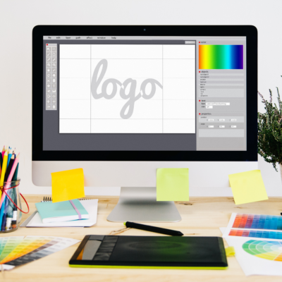
Present on all your communication and sales media, your logo is a rallying sign for your company. It conveys the image of your business and allows your customers, prospects and partners to recognise your products and communication elements at a glance.
To be effective, it must be easily identifiable and reflect values that are in line with in line with your company's sector of activity. For this reason, it is important to the meaning of the logo you are about to design or choose. you are about to design or choose.
In order to shed light on the meaning of the different forms that logos can take, we suggest that you analyse their qualities of evocation and legibility. You will then be able to define with complete peace of mind which form of logo seems the most relevant to you according to the market codes, your customers' expectations and your company's values.
Circular logos
The meaning of circular logos is one of the most obvious.
The circular logos evoke both softness and softness and fullness. There is a an idea of perfection in the circular shape. Circular logos can also convey the image of a label on a product on a product, such as a quality certification. Be careful, however, to counteract the lack of relief or dynamism that a round logo can also inspire by using bright colours, a strong typeface and graphic elements that provide sufficient character.
From an operational point of view, a circular logo is not always easy to insert on communication supports, it necessarily induces a loss of useful space. However, as the round shape is the one imposed by more and more media - in particular social networks - it will always be useful to use your logo in this shape.
Many well-established brands use the round shape for their logo. A circular logo printed as window sign on your shop window will be an eye-catcher and give your shop extra credibility in the eyes of passers-by.
Rectangular logos
Rectangular logos, with their wide baseimmediately evoke seriousness and seriousness and stability. This significance of rectangular logos has not escaped the attention of companies that want to build trust with their customers. Thus, companies specialising in the sale of technical or industrial products use this form of logo, which evokes resistance, durability.
Beyond their significance, rectangular logos have the advantage of being easily integrated into any written communication. What could be easier than slipping a rectangular logo into the corner of a flyer for example? Moreover, a rectangular logo is very useful on digital useful on digital media: it it allows you to have a rather imposing and visible logo without taking up too much space in height. Visitors to your web pages don't have to scroll to see your content immediately. need to scroll to immediately see the content of your site: your products or your products or services. However, experience shows that visibility and clicks on the elements located below this waterline, i.e. the part of your website that is only visible if the user scrolls down, are significantly lower. Using a rectangular logo allows you to maintain the visibility of your striking arguments while displaying your brand !
Square logos
The same applies to square logos, which are just as easy to easily deployed on all communication on all communication media. Square logos also evoke stability and precision (don't we say "being square"?), but their meaning also extends to notions structure and security. The square shape can be interpreted as protecting your company's name in the centre for example. For this reason, it is a preferred logo shape for companies in the banking or insurance sector.
A contrario, il peut véhiculer l’idée d’un manque de créativité. Pour trouver un équilibre entre ces notions, pourquoi ne pas “twister” un carré peut-être trop sage ? Soit en faisant pivoter le carré en diagonale, soit en intégrant la forme carrée dans un logo plus original par exemple.
Triangular logos
The triangular-shaped logos carry a meaning of meaning of overcoming, of challenge but also of power. It is a dynamic which is well suited to companies that wish to highlight their combative qualities and their taste for challenge. Several companies active in the sports equipment sector have chosen a triangular logo to to convey these meanings to their customers. In doing so, they are visually telling them that they will accompany them in their sporting exploits, that they will be equal to their efforts.
Diamond logos
The rhombus is a dynamic dynamicand is a dynamic balance. Rhombus logos carry a meaning of calm and movement at the same time. at the same time. This shape evokes a slow but sure progression. Major companies in the construction, retail and automotive industries have chosen this logo shape for these meanings. And if these companies have been able to evolve their logo over the years (by changing the colour range or the typography), they have kept this diamond shape synonymous with their certain success.
Polygon logos
The meanings of the polygon are, as its name suggests multiple. Polygon-shaped logos can evoke a kind of complexity. Depending on the number of sides, the polygon can convey different messages. The hexagon, with its six sides, is similar to a beehive and therefore evokes work or refers to the shape of France and therefore to the values of terroirsof homelandor even tradition. The pentagon, with its five sides, can also evoke a houseand therefore a certain security and comfortand comfort, as well as conveying an esoteric connotation of which it is important to be aware.
Organic logos
The term organic logos can be used to refer to all logos that are designed from from nature and living things. A plant, an animal, one of the four basic elements (water, air, fire and earth) or a human being can thus give shape to your brand. The meaning is often obvious: the notions of nature, organic, health, well-being come to mind. The meaning of an organic logo can also include links to the values of respect, understanding, exchange.
Meaning of logos: form is not enough!
We hope that this will give you some insight into the meaning of logo shapes. However, shape is not the only element that should be considered when designing your logo. The shape should be combined with a specific colour scheme and carefully chosen typography together forming the unique identity of your company.
The shape of a logo complements, contains and surrounds your company name. The colours you choose will accentuate one aspect or another of the different meanings of the shape you have chosen for your logo. All these elements must be thought of together.
Then, once your company's logo has been created, it will be necessary to define your company's entire graphic identity: what type of typography to use, what type and format of image to use, what library of iconography to favour?
The aim is to creating a library of graphic elements that will blend in perfectly with your logo and will be used on all your communication, sales or administrative materials, ensuring a lasting, consistent and quality image for every contact you have with your prospects, customers, partners and employees. Once you have made your decision and your logo is ready, we at Copymage will be at your disposal to decorate your and all your communication media with your company's logo in whatever form you choose!
-
- All
products - Cards
- Brochure
Files - Advertising
- Printing
- Office automation
- Adhesives
- Signage
- Themes
- Printing
Express in 4H - Newsletter
IMMEDIATE
CUSTOMISED QUOTE
Congés d'été
Nous serons fermés du 12 au 18 août.
Bon été à tous ! ☀️
Les commandes en ligne passées entre le 12 et le 18 août seront traitées à partir du 19 août.

