The proof stage is a crucial step in the printing of your communication materials. You have worked long hoursYou can use our services, alone or with your agency, to create business cards with your company's image, to design flyers announcing your next commercial operation or to choose the photograph that will adorn the counter of your shop. You are about to start printing. For ensure that the result will be exactly what you expectAt Copymage, we offer you the option of a print proof which you can consult in detail before asking us to print your materials.
In this article, we explain what a proof is and why consulting and signing a proof is a crucial step. We then walk you through the process of checking a proof by suggesting a series of elements that must be considered before signing a proof.
What is a proof of concept?
 A "Bon à tirer" or "BAT" is a unit proof in every respect similar to the final print job that you have ordered. It allows you to check that your material meets your expectations before printing it in larger quantities.
You want to print a magazine that presents your company, your products and your recent activities? Before printing the 1,000 or 1,500 copies that you will send to your employees that you are going to send to your employees, customers, partners and prospects, at Copymage, we submit a proof for printing or BAT. This is aa single copy of this magazine which allows you to check that that the result will meet your expectations.
For this reason, and to ensure that you are fully satisfied with the result of your printing work, we at Copymage invite you to Take the time to carefully review the proof before signing. Do not hesitate to to schedule this time for proofreading (by you and perhaps by some of your colleagues) in the planning of your communication campaigns. You will then be totally reassured and can ask us to launch the printing process with peace of mind !
What should be checked on a proof?
 Because this step is also importantIt can be a little bit stressful. At Copymage, we want to to accompany you in the best possible way in this moment that crowns all the work of designing your communication materials.
We have listed for you all the elements that you need to pay particular attention to when checking the when checking the proof:
- The presence of all the desired elements: sometimes because a font has not been integrated or because a layer in the design file has been unintentionally hidden when exporting for printing. unintentionally been hidden when exporting for printingSometimes, because a font has not been integrated or because a layer in the design file has been unintentionally hidden when exporting for printing, a title or visual, for example, may be missing. It may then be useful toprint a low definition pdf version version before delivery to the printer and compare with the proofIt's a bit like the game of 7 mistakes.
- The elements drafted Check that the document includes all the textual elements you want to include. Check that it includes, for example, your company details and a contact person who can respond to enquiries about your communication campaign.
- Spelling and grammar There is nothing worse than sending multi-staff business cards in which there is a shell. Carefully reread all the texts on your mediaYou should also check the names of your employees, especially those that you never check anymore because you use them all the time: the name of the street where your company is located, the names and functions of the employees mentioned, etc. A tip for not reading automatically: read your text backwardsThis means starting with the last sentence and working backwards. This allows you to focus on the details and not on the meaning of sentences.
- La police You have chosen one or more specific fonts for your flyers or booklets. Is the font large enough to be readableShould certain words or phrases be used in the same way as in the in bold, capital letters or italics to be given more prominence?
- Lhe colours Studies show that the colours chosen for communication materials have a great influence on the customers and prospects who receive them. For this reason, take the time to see if you are happy with the colours you have chosen when they appear on paper rather than on a screen - be aware of the distinction between RGB and CMYK colour matching!
- Finishing touches: at Copymage, we offer you numerous finishes for all your media. For example, gilding, selective varnishing and 3D varnishing are finishes that bring originality to your prints. When checking the proof of your selective varnish flyer, check if the varnish is present where you want it to be - the creation of this type of print file is not always easy when you are not used to it!
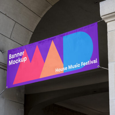
- Lhe cutting and trimming You have chosen the size of your poster by imagining it in space, now it is time to check that the elements reproduced on it are visible from a distancethat the size chosen allows for a even and aesthetic distribution of the different elements. In addition, it is also an opportunity to check that you have not forgotten the bleed when designing the file and that the final cut does not harm the elements on the poster, for example when printing board stickers.
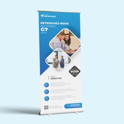
- The direction of reading and folding You have designed a 2-ply leaflet to present the services offered by your company and the corresponding prices. When reading the proofs, put yourself in the shoes of your customers and prospects and check that information is correctly prioritised according to the reading direction. Also pay attention to the location of folds on your leaflet: do they interfere with reading, are they placed on a text or an illustration?
- Les illustrations et les photographies : vous avez sélectionné des photographies pour illustrer les plats présents à la carte dans votre restaurant. La vérification du BAT sert à s’assurer que la qualité des photos est suffisamment bonne, qu’elles sont bien visibles sur le support, que les couleurs correspondent, etc. Si ce n’est pas le cas, peut-être faudra-t-il choisir des visuels de meilleure qualité. C’est aussi le moment de vérifier qu’il s’agit bien de la version d’image “achetée” sur laquelle ne figure plus, en filigrane, le nom de la banque d’images (présent dans les versions de prévisualisation avant achat). Méfiez-vous, ce genre d’erreurs arrive plus souvent qu’on ne le pense!
The BAT is a precaution that we take together to avoid any disappointment following the final printing of your communication materials. Take the time to read over the proof we submit before the complete printing.
At Copymage, we are also at your disposal to check the technical compliance of your files with the order placed (image compression (image compression, document size, number of pages....) free of charge. We are at your side to ensure that you are fully satisfied with your printing work with us.