The layout of a file is an essential step. Whether it's a thesis, a training book, an activity report or a promotional catalog, an effective layout:
- encourages readers to be interested in your document,
- maintains their attention from the beginning to the end of the document,
- allows a better understanding of the content,
- promotes the appropriation and memorization of key points.
For all these reasons, here are 5 tips for creating an optimal folder layout.
1st tip for an efficient file layout: choose the graphic elements
You have written in Word the texts you wish to incorporate in your document, it is now a question of determining the main graphic elements that will animate your editorial content.
- First of all, choose one or two fonts maximum to avoid confusion in your file. The main font will be used for the body of the text, a secondary font can be chosen for the titles. These fonts should be easily readable by everyone. Therefore, with few exceptions, avoid fonts that simulate handwriting (for example: Palace script or Comic sans MS) or exotic fonts (for example: playbill or curl MZ). In addition, the font you choose should reflect the spirit of your content: if you are designing a magazine, choose the Time New Roman font, which is reminiscent of newspaper typefaces.
- Choose a font size of at least 12 points for the body of the text to ensure readability for all. Only legal notices and footnotes may be written in font size 8 or 10.
- Select the parts of the text or the key words you want to highlight and choose a method of highlighting: bold, italics, use of a different color from the general text color. By doing so, you will highlight the main ideas and give rhythm to your document. Be careful not to overload your text, as this can put off readers, and to keep the layout consistent throughout your document.
- If relevant, you can select two or three symbols to mark specific headings or boxes. For example, in a training book, it may be useful to create boxes "to go further" containing bibliographic references. In this case, why not choose a pictogram in the shape of a book to indicate these boxes? Please note that these headings or boxes must appear at least twice to justify the use of a symbol. If there is only one, a well-written title will be sufficient.
Tip2 for an effective file layout: select illustrations
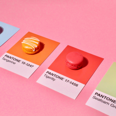
In order to make the reading more dynamic, it is always useful to insert illustrations related to the subject. These can be drawings or photographs. In the latter case, it is possible to choose photographs from royalty-free databases, such as shutterstock or pixabay. In the case of an activity report, we advise you to prefer photographs taken during real events reflecting the activities of your company or association. By putting in scene, employees, customers or members of the management, you will support your subject and will keep the attention of your readers.
The chosen photos must have similar tones throughout the publication in order to participate in a coherent layout of the file. They should both illustrate the editorial content and punctuate the reading as a breath of fresh air. In some cases, especially when the photos represent professional events experienced by the company, it can be clever to add a caption that specifies the date and title. These captions can use a smaller font size and be grey in color, for example, so as not to take precedence over the main text.
3rd tip for an effective file layout: air the document
A successful file layout is an airy file layout! We often fear white space, without text or photographs, when it is precisely these margins, these white outlines, these line breaks that allow readers to adopt a pleasant reading rhythm.
- Prefer several small paragraphs of 5 lines rather than one block of 20 or 25 lines. These smaller paragraphs should be separated from each other by line breaks that encourage breathing. Thevariation in thelength of the paragraphs allows you to give a rhythm to your file and to keep the attention of your readers.
- In a company report, thematize the contents by starting each thematic chapter with a blank page on the left, so that all the chapter headings and therefore all the titles containing important information will be on the right page. The client or prospect who would only leaf through your report would not be able to escape the themes that you develop.
- Don't forget to leave white margins all around your content: a file layout is more effective when the document contains more well-designed pages than fewer packed pages.
Tip4 for an effective file layout: pace the content
- Structure your content using two or three levels of headings. Each level of heading should have a specific formatting that is repeated throughout the document, so that the reader knows exactly where they are in their reading.
- Enumerations can benefit from being presented as bulleted lists to make a list of sales results, a variety of products or sales locations, for example, immediately apprehensible.
- An effective file layout can also, if the content lends itself to it, include boxes. These boxes can be themed and indicated by pictograms and/or solid colors. Be careful to choose colors that do not interfere with the readability of the text.
- Alternate text and photos to give readers time to absorb the ideas you develop. Don't hesitate to arrange the photos and texts in an original way to encourage the reader to follow what you are saying in an elaborate file layout.
Tip#5 for an effective file layout: stay measured
If all the elements described above: font, font weight, boxes, title levels, illustrations, etc. can contribute to creating an effective file layout, it is essential to remain moderate and consistent in these choices. Too many different colors, too many pictograms, boxes on every page or illustrations that are not consistent with each other can confuse the reader.
Thus, whenprinting a dissertation, we advise you to opt for a sober layout that will attest to the seriousness of your work:
- One font in three different sizes for headlines and another font for the rest of the text,
- some graphics using always the same range of colors,
- a text punctuated by line breaks and bullets.
Sometimes a few simple but consistent and appropriate elements are enough to create an effective file layout.
Finally, if you have spent a lot of time formatting your document, you may be interested to know that at Copymage we offer an Express option: in 4 hours we print dozens of copies of your activity report just in time for the board of directors!